Almost two years ago, even before the pandemic changed the world forever, we began asking ourselves, “does our brand identity reflect the Webex of today, and more importantly, the Webex we’re imagining and building for the future?” A rhetorical question, of course. We knew the answer. Our collaboration products have converged into a single, powerful app designed to give everyone the ability to collaborate and contribute equally, from anywhere. Now, the Webex brand no longer stands for video conferencing alone. Instead it is synonymous with the way the world works—in-person, and from remote locations, in real-time, and asynchronously, from a phone, or from a board room, heads down on a task, or context switching between many. A new requirement emerged that demanded more from our brand identity and visual language—to reflect the energy, diversity, and flow of collaboration in this new era of hybrid work. Here are a few principles that guide our design decisions.
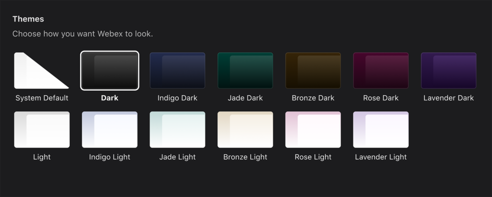
 New color themes to help you customize Webex to match your personality and mood. Choose between Indigo, Jade, Bronze, Rose and Lavender – each available in light or dark mode.
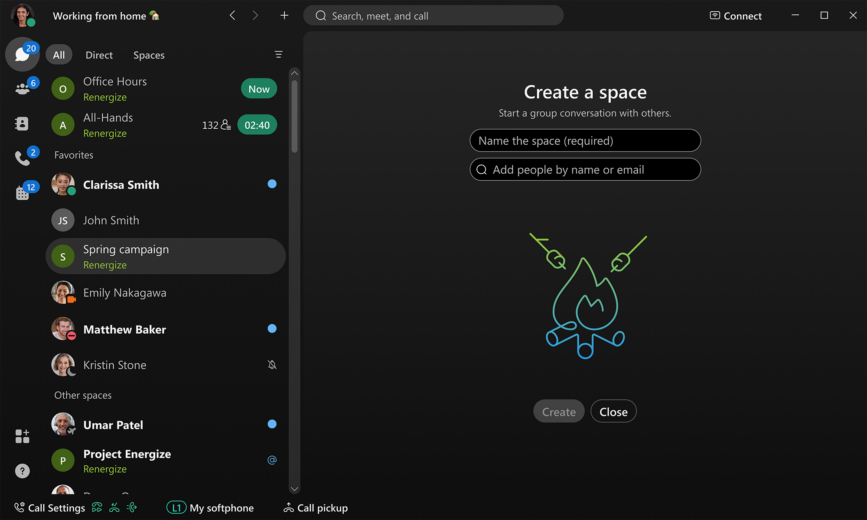
  Fun and functional new illustration and iconography throughout the app to make key activities more intuitive.
 Mobile Our iPhone users will notice some layout changes that make key actions more natural. We removed the floating action button on the bottom of the screen and replaced it with a pull-down button. Look for the plus sign (+) on the top right corner of your screen to start spaces and DMs, create teams, and add contacts. We removed the search bar to make room for something new! You can now find search on the bottom right corner of your screen in the tab bar. To make sure Webex is more inclusive, we introduced some important accessibility enhancements with increased type sizes, larger icons, and stronger color contrasts.
  With slick new UI changes, countless accessibility enhancements, and innovative new features that are constantly being added, we are only beginning our transformation of Webex in the journey to hybrid work. While many of these changes are aesthetic, the work done here also includes some major uplifts under the hood to make Webex more accessible, usable and performant.
Crafting our new identity
We explored a range of directions, but several adjectives continued to resurface — diverse, vibrant, focused, fluid, and lasting. Needless to say, rebranding an established product like Webex is no small feat. We homed in on a direction that we believe best captures the passion we feel for creating great collaboration experiences and honors the needs of our current and future users. Our users rely heavily on the products we build to get work done. But it’s not just about efficiency and productivity. It’s about connecting with each other, exchanging ideas, working smarter, and having fun. In June, we introduced the new Webex logo and a fresh take on dark mode; in August, we released new illustrations in the apps. Now, we’re pleased to announce a refreshed UI that embodies the new Webex brand rolling out in November to all customers. Meet the new Webex!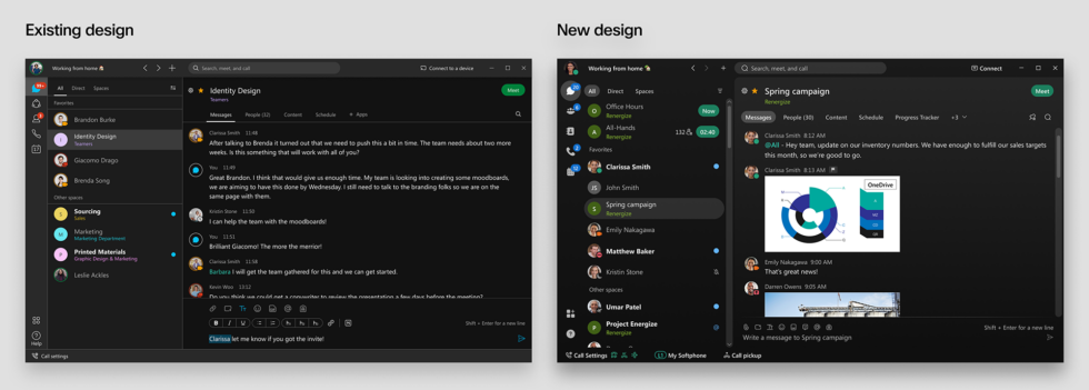 Here are a few principles that guide our design decisions.
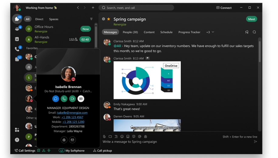
- Seamless Flow Rounded, approachable UI elements and fluid layouts
- Vibrant energy Deliberate use of color, gradients, motion
- Intuitive focus Affordance with clear iconography and controls
- Infinite identity Reactions, themes, custom status, cover images, and more
User experience enhancements
New and intuitive presence visuals that allow you to easily see when your contacts are available, away, on a call, presenting, or out of office. New color themes to help you customize Webex to match your personality and mood. Choose between Indigo, Jade, Bronze, Rose and Lavender – each available in light or dark mode.
  Fun and functional new illustration and iconography throughout the app to make key activities more intuitive.
Natively iOS, distinctly Webex
Webex on iPhone and iPad has been redesigned! We changed the presence icons and added new themes and illustrations to reflect the changes in the rebrand. We also consolidated tabs in the tab bar to make navigation around Webex easier. The message compose area has been enhanced with a clearer send button and larger supporting icons to accommodate accessibility requirements and make Webex more inclusive. iPad We have updated Webex to a new 3-column layout that simplifies navigation. We also adopted iOS iconography to ensure basic functions are more familiar and intuitive.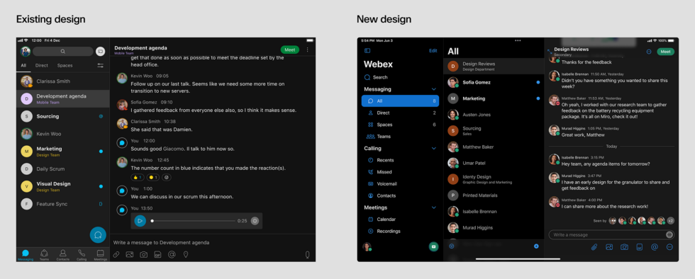 Mobile Our iPhone users will notice some layout changes that make key actions more natural. We removed the floating action button on the bottom of the screen and replaced it with a pull-down button. Look for the plus sign (+) on the top right corner of your screen to start spaces and DMs, create teams, and add contacts. We removed the search bar to make room for something new! You can now find search on the bottom right corner of your screen in the tab bar. To make sure Webex is more inclusive, we introduced some important accessibility enhancements with increased type sizes, larger icons, and stronger color contrasts.
  With slick new UI changes, countless accessibility enhancements, and innovative new features that are constantly being added, we are only beginning our transformation of Webex in the journey to hybrid work. While many of these changes are aesthetic, the work done here also includes some major uplifts under the hood to make Webex more accessible, usable and performant.
These updates will be available to everyone in November. Click here to learn more.Learn more What’s new in Webex: October 2021 What’s new with Collaboration AI: Powering the future of hybrid work Unlock frictionless collaboration with apps right inside Webex
